Root Node Thumbnail Logo
/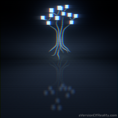
A few weeks back I made a logo for a friend's Soundcloud.com music project, Root Node.
We wanted something simple that would look good as a small thumbnail image. The concept was a more literal node tree than we see in Blender's node editor. My friend gave me a doodled sketch, and I re-created it with Blender and threw in some compositor effects. I recently shared it in the Blender NPR facebook group, and enough people were curious about how it was made that I will share the settings and file.
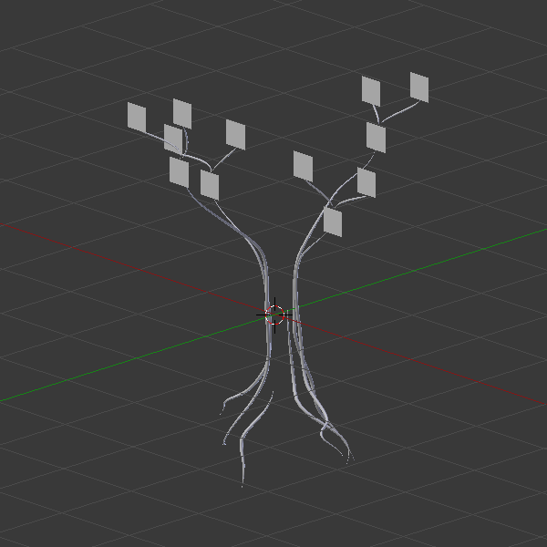
The Objects
Simple reflective material used for the floor plane.
The scene is straightforward. I made curves that matched my friend's sketch, extruded and tapered them with other curve objects, and gave them depth so they could be affected by perspective and lens distortion. Planes were placed to act as the leaves of the node tree. A ground plane is placed below the tree to catch the reflection. The World color was set to black. No lamps were necessary as emission shaders are used.
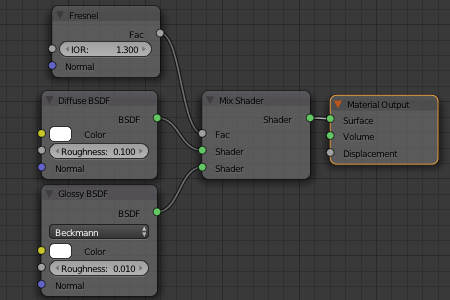
The Materials
The tree and leaves are a light blue emission with a strength of 2. This is the only lighting in the scene. The floor plane has a reflective material with enough roughness to see light glowing around the tree and leaves. Since the glow on the tree and leaves itself was made in the compositor, the reflection isn't actually accurate. But the roughness was set to have it look close enough.
The Compositor Settings
Most of what makes this image interesting came from the compositor settings. They provide the glow and the scan lines. The glow in the current compositor settings is stronger than in the original image as we had experimented with it more since making the render we chose to use in the end.
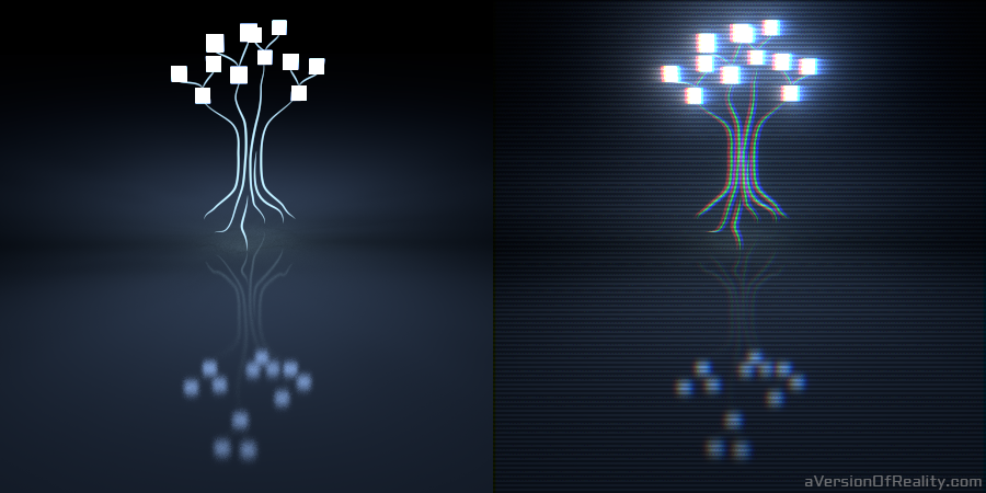
Before and after compositor effects.
Two glare nodes were used: one for fog, and one for glow streaks. See this Blender Nerd tutorial for information on compositor glow effects.
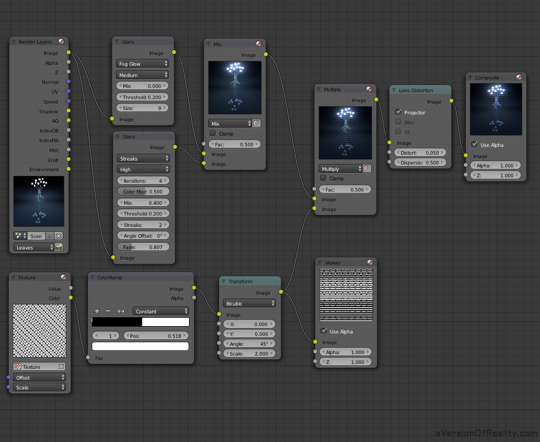
The full compositor nodes. Click for full resolution image.
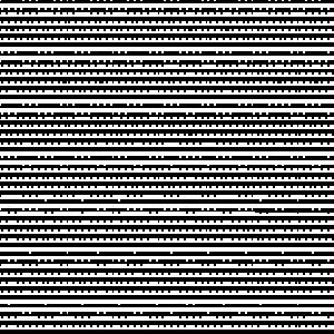
The scan lines are quite an eyesore on their own.
The largest impact on the image is the scan lines. We wanted it to look like an old CRT monitor. For this, we needed grainy lines. We used a wood texture to get the lines, scaled it by a factor of 50 (in the node Offset menu), then color ramped and rotated it. The color ramp knocks out all the gray, leaving the lines very pixelated and grainy. Since the image it is being mixed with is only bright in a few places, it disappears in the dark at the edges, and only shows in the light parts of the image.
The File
I've uploaded the file to Blendswap for anyone that wants to check it out for themselves. If you have questions, leave a comment here or ask me on Facebook.